If you have visited in Israel this summer and missed a such exhibition. It was unforgivable omission. Design Museum Holon opened in June the retrospective exposition of the Japanese studio Nendo and its founder talented designer Oki Sato.
To define the exhibition as the look at the past is difficult, because Oki Sato is not even forty years. But his creative life is so intense and full of implementations of different ideas that’s why the full display of his multifaceted creativity have been able to arrange.
I won’t talk anything about the show, who can to visit it, go there till 29 October. I would appreciate hearing your thoughts about this.The curator of this exhibition is Italian and the professional success of Oki Sato begun from the cooperation with italian companies.
It is also interesting that the designer himself has offered original ideas for your presentation in the museum.
Each exhibit or project is located in a defined space, something like a box. The viewer is between these blocks and strolling along the streets like one of inhabitants of the worlds of this subjects. It gave the name of whole exhibition «Space in between».
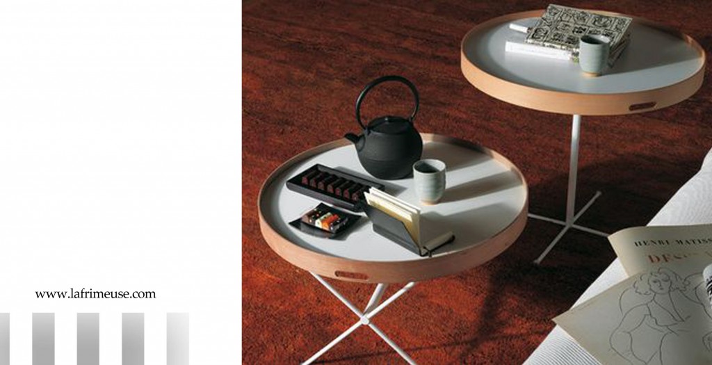
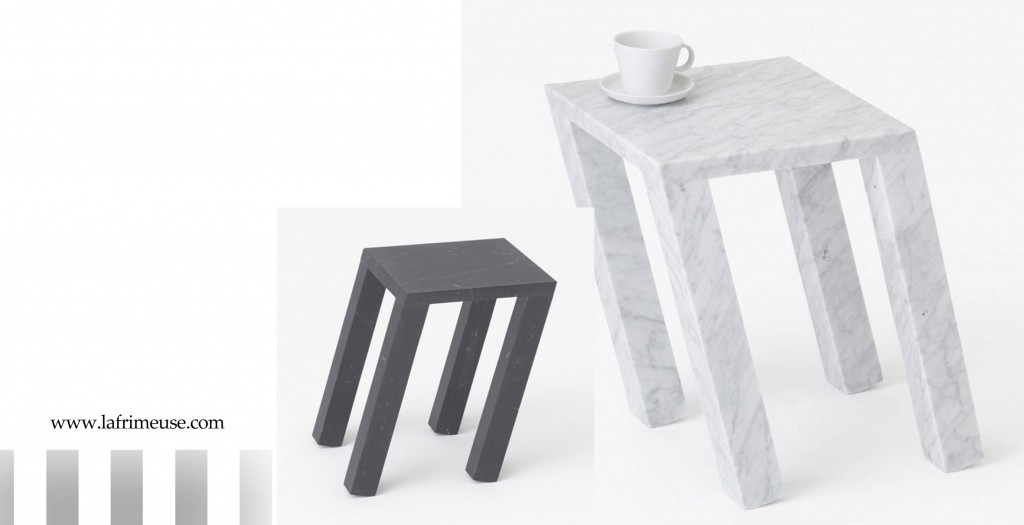
Chab-table for De Padova
Oki Sato was born in Canada, but he got M.A. in Architecture, Waseda University, Tokyo. After that Oki Cato went as a tourist to the Italian design exhibition and was so inspired that he created his own studio «Nendo». (clay in Japanese).
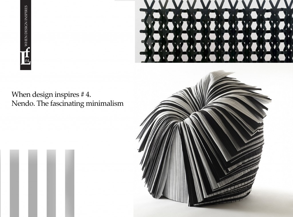
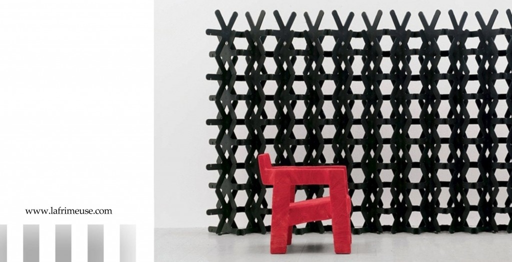
In 2005, the studio has offered a conceptual solution Chab-table table for De Padova. And the way to great design began. Then there was a project to Giulio Cappellini, for which Сato made a touching and intelligent design – screen Yuki, «snowflake” in Japanese, for which received a Red Dot Award.
screen Yuki
Since then, his minimalist style with some portions of irony and subtle humor is highly valued among both clients and professional environment. Oki Sato has many prestigious design awards.
The design of individual items isn’t one thing of the circle of studio’s interests, but the designers also create an environment in general.
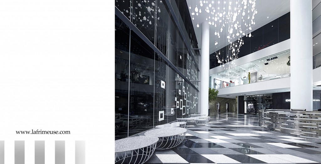
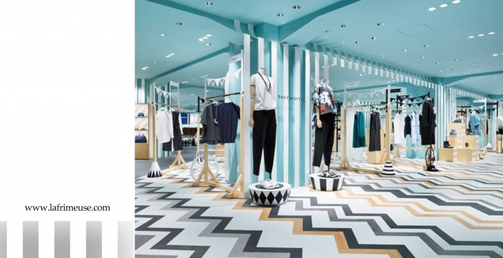
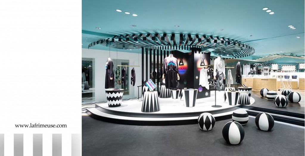
One of the last projects of Nendo was the reconstruction of the department store in Bangkok. The store is located in a group of luxury hotels and boutique shops, there is also museum of madame Tussauds and the ice rink, but the attendance of the place was low.
Nendo completely redesigned shopping areas and created other unique worlds. For each brand represented in a department store the studio made the original space. And although the forms are complicated, it does not seem something like a conglomeration. Everything is made of lightweight constructions. Wood, metal, glass and mirrors don’t distract potential buyers, but they create a fantastic festival atmosphere.
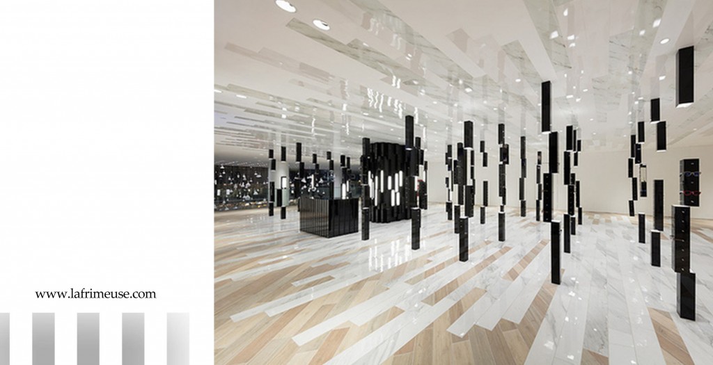
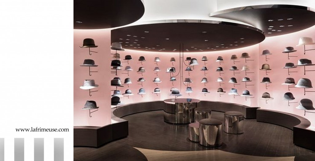
Another virtuoso Nendo’s project is interior design of department millinery and fashion women’s clothing for the department store Seibu in Tokyo in which they have repeatedly worked.
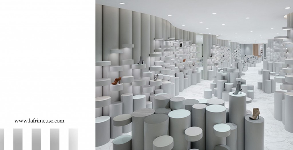
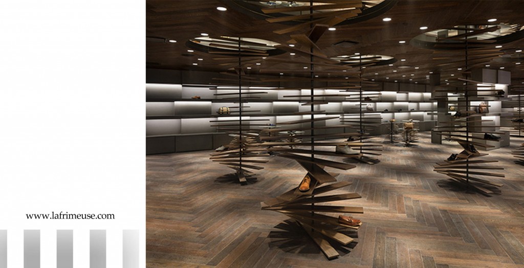
the department store Seibu in Tokyo
And again, Japanese designers without changing own style have created the space by clean colors and shapes and precise geometry. A combination of textures, materials, colors game of contrasts, transparency and reflection surfaces are intriguing, offering to go on and see objects closer.
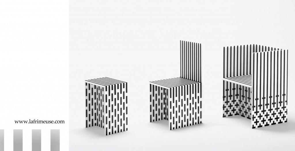
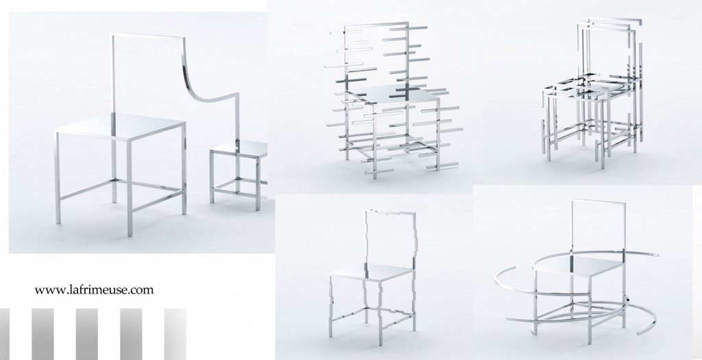
Manga series includes 50 chairs was inspired by the popular Japanese comics.
The chairs are made of polished stainless steel. The mirror surfaces of objects reflects the reality, as well as manga embodies the surrounding reality. Each of the chairs is an association with speech, emotions, actions that take place in these comics.
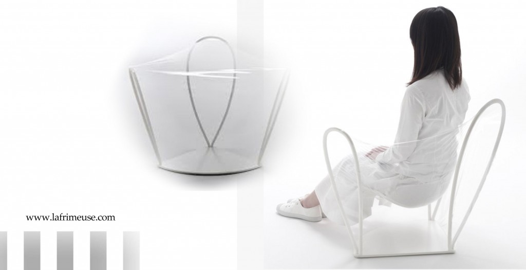
Nendo offered the original model transparent chair at Design Week in Milan in 2011. Simple, but at the same time unusual, chair has a backrest and armrests made of polyurethane and metal frame, which is mainly used as packaging for precision tools. The transparent elastic material easily returns to its original shape.
Ideas, according to Oki Sato come to him from everyday life. And a drop of water flowing over the surface of the sink after washing can be a source of inspiration.
To discard excess, to focus on effectively and efficiently simple forms, do not to be academically rigorous and serious and to add a bit of irony is probably a creative formula of Japanese designer.
photo from http://www.admagazine.ru
http://homeguide.ru/nendo-design-studio/
