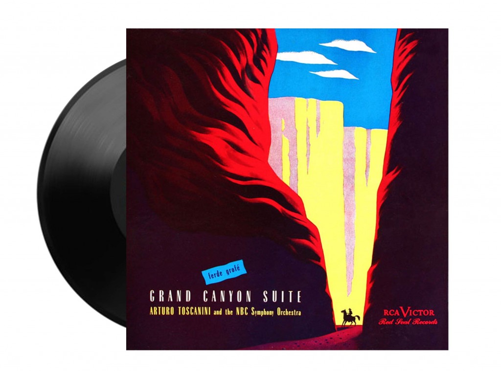
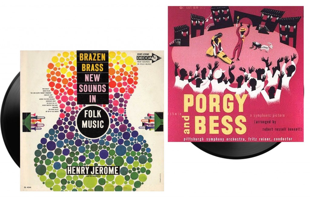
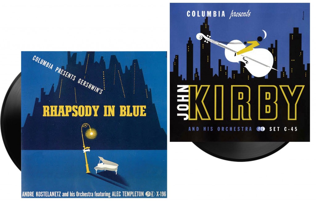
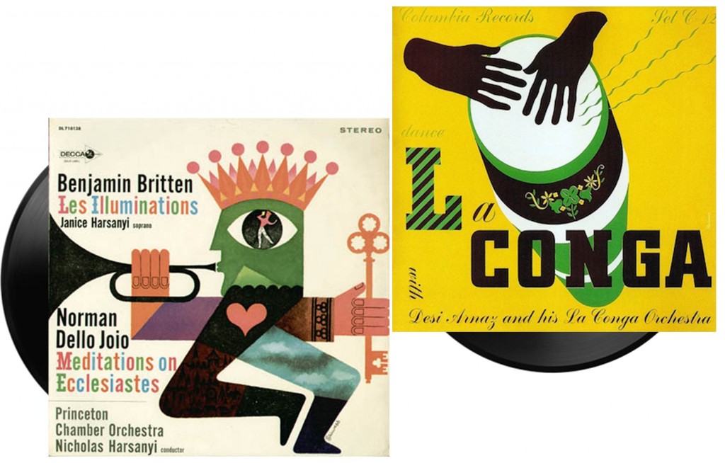
То transfer music rhythm, melody, emotions visually is a rather difficult task. But if the artist comes to the right way, it turns out a true masterpiece, combining two fine arts.
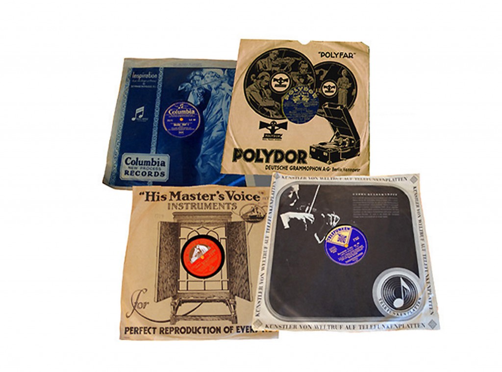
Before this moment when one brilliant and simultaneously simple idea had came to Alex Steinweiss, a New York graphic designer, music albums packaged in a plain sleeves made of brown wrapping paper.
The sleeves for vinyl in 1930s
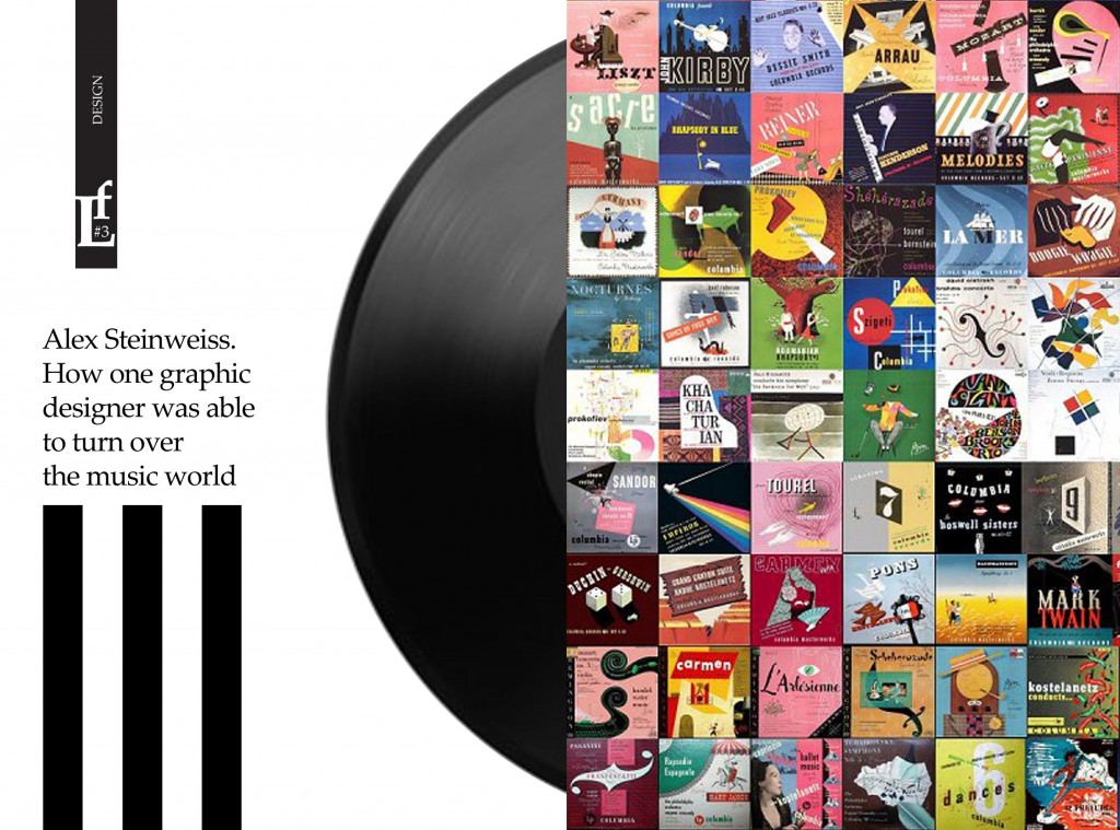
His thought was to create vivid images on the packaging and it was a huge success. On could say it was the breakthrough in the music industry. In one month, the number of sold album increased by 800 percent.
He worked for a company of Columbia RecordsFrom 1939 to 1945. The designer came up with a huge number of bright sleeves for vinyl LPs.
His works are original, full of air and the musical vibrations, which are sealed in the packaging.
Alex Steinweiss was unique in that it not only created an advertising packaging. It were always mini posters, mini stories about the musical works in the tradition of the French and German graphic design of the 1930s. He passionately loved and felt the music and his interpretation is unquestionably reflect it.
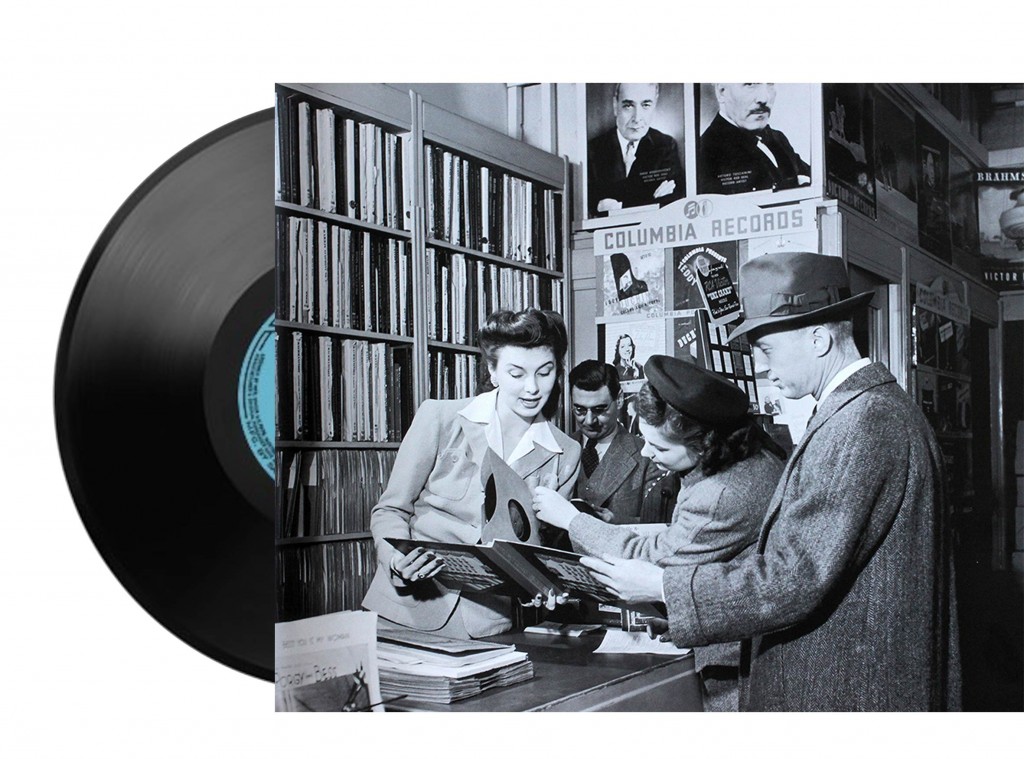
The works of Steinweiss tempted the music lovers who came to music stores, and then forced them to rush home to get it out of the sleeve a promised masterpiece.
Working in the «pre-computer era», he needed to make not only hand-written lettering and created his own font Steinweiss Scrawl, but to execute separations for printing by hand, because the technical process was only black and white.
With the development of printing processes, record companies increasingly prefered to put photos of artists on the covers of music albums. In 50 years of Alex Steinweiss he left the company and started his own creativity. He lived a long life (1917 – 2011). His contribution to the history of graphic design for some time, has not been evaluated, but now Alex Steinweiss is considered one of the unique graphic designers.
